Web designers that cut their teeth in the late 90’s and early 2000’s probably remember table-based layouts. This was a time when some webmasters forced their sites into perfect configuration using HTML data tables, spacer GIF images and a few kindred hacks. But for a while there, there weren’t a whole lot of options in terms of visual design. This is an attempt to trace that back and try to figure out where things went so wrong.
At first glance, you may be tempted to blame David Siegel (don’t worry, he kind of blames himself too).
Siegel wrote a book in 1996 called Creating Killer Websites. In it, he advocated for visual design hacks over the semantic web. Siegel laid out in clear detail the limitations of the web medium, and argued that making sites look and feel good for users was paramount, even if it meant straying a bit from the intended use of web standards. To that end, he outlined a few browser hacks that let web designers create structured layouts with even margins. Perhaps the most popular of these techniques was the use of HTML tables to create multi-dimensional, nested grids.
At the time, however, Siegel had a point. There was really no way to create a proper grid without some serious hacks.
The late ’90s were a bit of a tough time to be a web designer. The so-called “Browser Wars” were raging all around, which basically meant that the two big browsers, Netscape and Internet Explorer, packed as many exclusive HTML features into their browser as possible. But that also meant that if your site looked great in one browser, it might completely fall apart in another. Meanwhile, development of the HTML standard lagged behind browser implementation. Releases of new specifications were years apart, and didn’t include the features designers clamored for. CSS existed, sure, but it was far from a best practice or dependable standard.
So if you’re a designer in the late ’90s, the only way to add a layout to your web page was to use a combination of Netscape-only tags (like <layer> or <multicol>), Internet Explorer-only CSS features, and underdeveloped presentational elements. The rest of your site’s design was left entirely up to browsers.
That is, of course, except for some new technologies that were really starting to gain some traction in all the wrong ways: Tables and Frames.
Tables weren’t built for layout of course. They were added by Mosaic (which later became Netscape) after the first official recommendation of HTML was published in 1993. At the time, the standards process couldn’t keep up with the pace of browser development. So even HTML 2.0, which was completed in November of 1995, did not include most advanced browser features, including tables.
To bridge this gap Dave Raggett, a standards advocate, began writing a parallel specification he called HTML+. HTML+ expanded on the existing first version of HTML but also added some newer features that developers were already using, like the fig tag, advanced forms and, (you guessed it) tables. Things got a bit rocky from there. Raggett attempted to take his ideas from HTML+ and incorporate it into HTML version 3. However, this entire draft was abandoned and eventually morphed into HTML 3.2, which wasn’t completed until January of 1997.
And all this time, tables existed in a kind of stasis. Not officially documented, but widespread and pervasively adopted. The big advantage of tables was that they let you specify the exact widths and heights of each column. So, if you could imagine a webpage as a giant table, you could use HTML to create a two column layout, a grid of images, or just about anything. These tables were meant for data, but they could be used to create full page layouts. On top of that, tables could be nested, which meant designers could nest grids inside of other grids.
This came with some pretty major drawbacks. For one, it took a while for browsers to calculate these columns properly so there was a fairly significant performance impact. But even more importantly, accessibility went right out the window. Assistive devices attempting to parse this data would interpret everything as a table and get completely lost. Search engines had the same problem.
If these problems seem bad, they went double for frames. Like tables, frames can be traced back to Netscape. The team there suggested that frames became part of the HTML 3.0 specification, but it wouldn’t actually make it into a web standard until HTML 4.0.
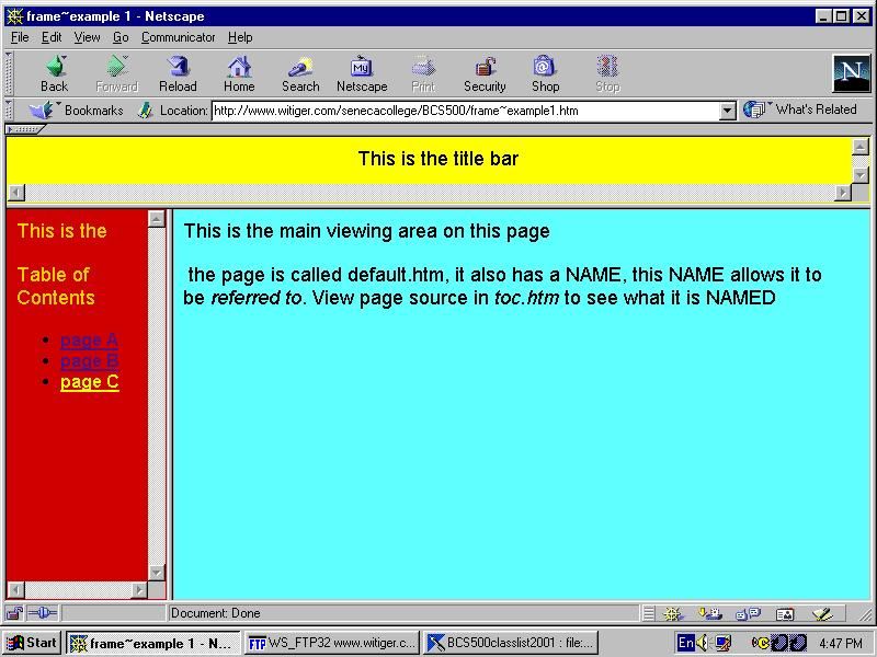
Frames are a bit difficult to explain if you haven’t seen them in action (so here’s an example). Basically, developers could embed a HTML file into a webpage. It was basically the equivalent of loading one webpage into another, and it has ties to the iframe of today.
Like tables, frames let you define exact widths and heights. But they also divided a page into independent containers. Imagine having two or three (or more) websites that all existed in one place. You could scroll through one page, then move your mouse and scroll through another. That’s what a frameset was. Generally, these webpages were completely separate, but with some effort, developers could make two frames communicate with one another.
Frames served an interesting function. Before the days of CMS’, frames could be used as a sort of template partial. Site owners could create a single navigation.html file, and then just include it inside of a frame on every page of their website. To update the navigation, they would no longer have to painstakingly go from page to page and update things. They could update once and see the change everywhere. And because of the nature of frames, this navigation would stick to the top of the page, even when users scrolled through content.
The downside, of course, was that frames were almost impossible to parse by search engines and assistive devices. And the performance impact was an even bigger hit than with tables. Still, some developers weighed the options and saw it as their best alternative.
When it came out, Creating Killer Websites acted as a lightning rod for eschewing web standards. But people ignored the cautious approach Siegel suggested and instead filled their webpages with nested tables and multiple framesets. Slowly but surely, web standards caught up. Once HTML implementations were fairly similar across browsers and CSS emerged as a best practice, people began moving away from table and frame based layouts. But this wasn’t until the early to mid 2000s. And by then, a lot of damage was done.
So yes, there are times when web standards can feel like a constraint. But remember, the web was built for everyone and made to work everywhere. This doesn’t happen without some serious forethought and cooperation. When these processes are abandoned, we are left with a whole lot of ugly, unusable and ephemeral websites, unable to stand the test of time.
Sources
- Dan Shafer. "HTML Utopia: Designing Without Tables Using CSS, Chapter 4: CSS Website Design." Sitepoint. May 5, 2003. https://www.sitepoint.com/css-4-css-website-design/
- Tom Chaplin. "To Frame or not to Frame?." Sitepoint. February 2, 2000. https://web.archive.org/web/20040316120747/http://www.sitepoint.com/article/122/
- David Siegel. "The Web Is Ruined and I ruined it." XML. October 10, 1997. https://www.xml.com/pub/a/w3j/s1.people.html
- Danny Hill and Julie Hill. "The I Hate Frames Frames Page." January 1997. http://users.ipa.net/~djhill/frmain.html
- Eric Ladd. "Chapter 13 Frames." Using HTML 3.2, Java 1.1, and CGI. January 1997. https://web.archive.org/web/20071030083252/http://docs.rinet.ru/HTMLnya/ch13.htm
- Jakob Nielsen. "Why Frames Suck (Most of the Time)." Nielsen Norman Group. December 12, 1996. https://www.nngroup.com/articles/why-frames-suck-most-of-the-time/
- Alex Edelstein. "A proposal for addition to HTML 3.0: Frames." WWW-HTML Mailing List. September 9, 1995. https://lists.w3.org/Archives/Public/www-html/1995Sep/0034.html

Leave a Reply