The web, as a visual and interactive medium, is still pretty new. Designing for the web has always meant striking a balance between influence from other mediums like print and brand new attitudes. The most revolutionary techniques in web design managed to find that balance, and pushed the web forward in leaps and bounds. Little by little, breakthrough after breakthrough, layout on the web has advanced.
Let’s start with A Dao of Web Design.
A Dao was written by John Allsopp in the spring of 2000 for A List Apart. Allsopp understood the web as a diverse, malleable and unprecedentedly far-reaching experience. It was accessed by millions of users around the world on any number of devices. Windows or Mac computers, small or large screens, and black and white or color monitors. Yet when he took stock of common techniques, he found that designers often tried to fight against the web, setting font sizes to rigid points so they couldn’t be changed by the user, or creating fixed layouts that only worked on large resolution displays. He saw a community that was still reaching into the same bag of tricks that worked for print design. But flexibility, Allsopp argued, was an instrumental feature of the web.
The web’s greatest strength, I believe, is often seen as a limitation, as a defect. It is the nature of the web to be flexible, and it should be our role as designers and developers to embrace this flexibility, and produce pages which, by being flexible, are accessible to all.
Allsopp made an appeal to his fellow designers. Stop trying to control the web. Cast off the shadow of print design. Instead, let designs flow from the grain of the web. Embrace its flexibility and find ways to hand off control to the user.
He followed up his ideological plea with some practical advice. He suggested using relative units like ems for fonts. He asked that designers make accessibility a priority as not everyone experiences the web the same way. And perhaps most saliently, he challenged designers to turn away from the fixed-width tables that were the fashion of the day and use CSS to construct fluid, flexible, percentage-based grid layouts.
Even before A Dao of Web Design was published though, there were attempts in the design community to reverse the trend of fixed widths. One of the first was known as liquid layout.
As far as I can tell the first liquid layout was used on ProjectCool in 1996. The site itself hosted resources for web designers, and was launched to early Internet celebrity status for its once-daily updated gallery called (rather self-explanatorily) “Cool Site of the Day.” The site was created by Glenn Davis, a co-founder of the Web Standards Project (WaSP), who firmly believed that if your site was broken for even a single user, it wasn’t worth having a website at all.
Davis argued that there were three types of designs on the web, Liquid, Jello and Ice. Ice designs were rigid and built for an exact size, literally “frozen” in the browser at a fixed width. Jello designs allowed for some adaptivity, centering itself a bit to accommodate a few different device sizes, but ultimately fixed in the center. Liquid, which Davis considered the “epitome of good web design,” was entirely fluid, resizing to whatever browser window a user happened to be using at the time. Davis advocating for greater use of this so-called liquid design, to make sure that no matter who was using your website, it provided an optimal experience.
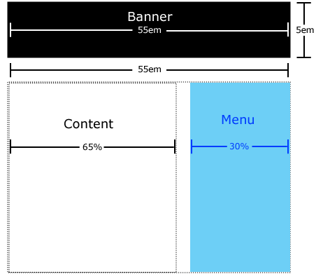
Instead of setting width in pixels, Davis advocated for the use of percentages when constructing grid based layouts. In his posts about liquid design, Davis described different ways to accomplish this, sometimes turning to HTML tables, and other times using frames or HTML tags that made use of the align attribute.
For instance, a sidebar might be 30%, and the main content 70%. By using percentages instead of pixels, the browser was able to decide how wide to make each column, and designs stretched and squeezed based on where it was viewed. It was a forward thinking and resolution independent way of doing things.
Davis presented the idea of liquid design at a conference in early 1996, and from there it became a pretty massive hit among standards advocates and Internet pioneers. It was one of the first techniques that really felt of-the-web and shook up the standard way of doing things. In the years that followed, designers put their own spins on liquid layout. Some added a single fixed-width column that anchored the whole design. Others wrapped the whole thing in a larger, pixel-width table to emulate a sort of max-width attribute for the design. And the web kept on tinkering.
A few years later, when Allsopp published A Dao of Web Design, he added a single crucial ingredient to the mix: CSS.
Like Davis, Allsopp was a member of WaSP. His biggest takeaway from that organization was the importance of separating style from structure. At the time, there were very few ways of doing that. The HTML of a page more or less dictated both a webpages content and presentation, mostly thanks to a lack of alternatives. But CSS offered a way to move the presentation of content out of HTML. So when Allsopp made the case for liquid layout, he was drawing on the impressive efforts of those that came before him, but he was also necessarily making the case for CSS itself. That proved to be a radical move.
It was also all the motivation a lot of designers needed to start digging into CSS, resulting in a sudden rush of new techniques and clever hacks.
In 2003, the web community was introduced to an interesting trick for flexible images. Several designers noticed that if you set an image to a max-width of 100%, then it would never spill outside of its parent container (even if the width of the image was set in CSS). So that was one headache cured.
Another was solved not longer after. One of the attributes in CSS is called float, which allows for elements to be “floated” inside of other elements (to the left or right). The cool thing was, when you stacked two floated elements next to each other, you were actually able to construct a pretty basic grid. The problem was, unless everything was perfectly aligned, the layout started to break apart. With a few lines of CSS, this could be solved in what became known as the “clearfix,” an elegantly simple hack that forced floated elements into place. I doubt very much grid-based design on the web would have lasted long without the clearfix.

In 2004, Cameron Adams proposed another interesting trick that he called resolution dependent layout. Using a bit of Javascript, Adams devised a technique to detect the resolution of the monitor a user was using, and then swap out entire stylesheets based on the result. So a user with a 1280 pixel monitor might get a larger grid and typography, while a 640 pixel monitor might get a tighter grid or one-column layout. The technique was never widely adopted, but it certainly foreshadowed what would ultimately become media queries (more on that in the next part).
By that point, there were quite a number of differing, though still complementary, approaches to web design. It was a bit of a struggle for some designers to wrap their head around exactly what to use and when. Zoe Gillenwater, who added a number of techniques to the mix herself, organized these disparate tactics into two groups, liquid and elastic, under the umbrella of flexible design. Liquid layouts, like their earliest predecessors, depended on percentages for grid constructions. Elastic layouts were derived from the more controlled ems units to give a consistent rhythm to pages.
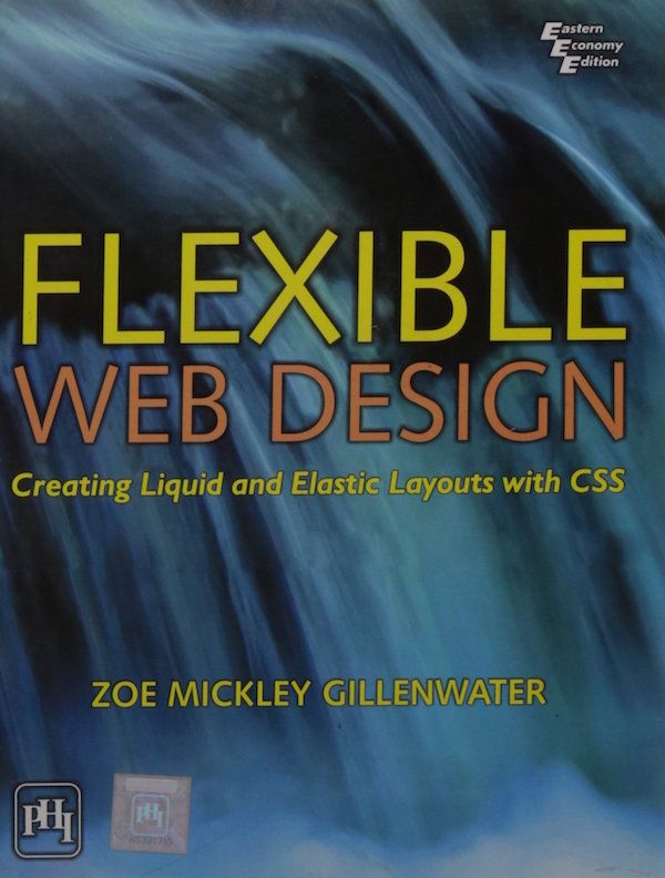
Gillenwater eventually compiled her tutorials and code samples in the book Flexible Web Design, which served as a handbook for web developers looking to make the switch to fluid layouts. It represented over a decade of collective knowledge and experimentation, and offered cutting edge best practices for an evolving web.
But just on the horizon, there loomed a new device. One that fit into the palm of your hand, that would change everything.
Part 2: Responsive Design
Responsive design, though it may feel foundational and second-nature to some of you, did not simply blink into existence. It stands on the shoulders of the greatest achievements in web design, building off of years of trial and error. In fact, I’m not exaggerating when I say the history of responsive design is the history of layout on the web.
Already, flexible web design had become the dominant design philosophy on the web, its origin dating all the way back to the late 90’s. It was thanks to skilled developers like Glenn Davis, Cameron Adams, and Zoe Gillenwater that the web managed to shake off some of the influences of print design, and forge its own path. And responsive design was largely an extension and continuation of the principles of liquid and flexible design.
And all the while, the W3C was working on something new for CSS called media queries. Media queries were going to allow developers to specifically target device characteristics, like resolution and viewport width, and change the attributes of CSS selectors based on the result. So it would, for instance, be possible to define one set of styles for large, high-resolution displays and an entirely different set of styles for a much smaller one.
Media queries were nothing new. When Håkon Wium Lie drafted up the original proposal for CSS back in 1994, he included them in, but they were scrapped in an effort to make CSS1 lean and easy to implement. That didn’t stop the W3C from trying though. When the specification for CSS Level 2 was published in 1997, it also included a sample implementation of media queries. Yet still, browsers didn’t implement the feature. It would take 15 years for media queries to actually make their way into browsers, starting in 2009.
Which, of course, had everything to do with the iPhone.
Steve Jobs demoed the iPhone for the very first time in early 2007 at Macworld San Francisco. They started selling later that year, and instantly changed everything about our digital lives. The web was no exception. The iPhone came bundled with its own Safari browser (minus Flash support), fully loaded with the latest HTML5 and CSS standards.
There was a bit of a snag though. Most of the web had been designed for larger screens, built on top of 12 column grids that broke content out into 2 or three separate columns. That was far too wide for a 320 pixel screen. Websites that had stuck to fixed-width designs were basically hopeless. But even fluid layouts got pretty squished on the iPhone and required users to clunkily pinch and zoom their way around the web.
The first widespread solution to this problem was to create a new site altogether, one that was built specifically for the iPhone. Usually this site was placed on an m subdomain, earning the moniker m-dot sites. A little bit of device detection determined if you were using a mobile device like the iPhone and redirected visitors to the m-dot site, often with different HTML and always with different CSS and layout, something like a one-column grid.
At best, this technique was always meant as a stopgap. The device detection was buggy at best. And already, Apple was making plans for the iPad, and other companies put out their own lines of mobile devices, each with a different form factor. A growing number of devices meant an ever-increasing number of codebases to maintain. One site for each new type of device.
Ethan Marcotte was determined to find a better way.
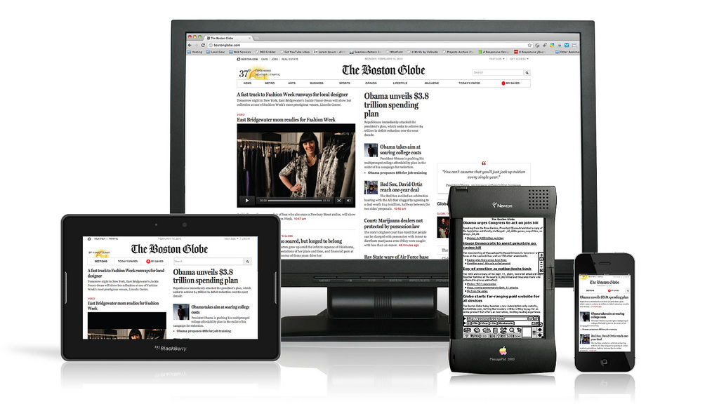
He and his team at Filament Group were working on exactly this problem for a new version of the Boston Globe. An m-dot site was out of the question for them. There was, as mentioned, the issue of maintenance. Filament didn’t want to have to independently keep up with two separate codebases. That was definitely one reason for their decision.
Here’s another. Marcotte was a member of the Web Standards Project. He and his colleagues were standards advocates going way back. They understood that just like in the earliest days of web layout, the iPhone was just another (given, an extreme one) example of the web being flexible. Nothing had changed. Separation of style from structure was still essential. Mobile sites violated this principle; mobile users were served different markup, and ultimately different content, from desktop users. Content was being dictated by presentation, and the web was sliding backwards to the days before CSS.
So Marcotte got to work on something new, mixing together the most clever techniques of the past. He turned first to flexible grids, already a best practice in most web design circles. When coded up properly, fluid grids would expand and shrink based on the width of the viewport. Using percentage width grid columns, and a few clever styles, he could at least make sites that were usable on desktop and mobile browsers using the same CSS. They might be squeezed extra tight on mobile devices, but at least it rendered the content usable.
Images were still a problem though, as they were constantly bursting outside of their container and out onto the sides of the screen. So he pulled in the flexible images technique, adding one simple CSS rule to iron that all out:
img {
  max-width: 100%;
}
The final touch though, Marcotte’s greatest insight, was media queries. He was inspired by what Cameron Adams had done with resolution-dependent layouts and realized that with media queries finally making their way into browsers he could do something similar. Except he wouldn’t have to turn to hacky Javascript for a solution, he could fall back on the latest developments of CSS.
Using media queries, Marcotte laid out a new approach for web layout. One he called responsive web design. It allowed for one set of styles to be defined for smaller screens, and another for larger screens. Media queries meant developers could group together a list of rules for devices under, say, 400 pixels. And they could have another group of rules for devices larger than that. Two designs. One codebase. And the combination of fluid grids and flexible images took care of everything in the middle.
Marcotte published this new approach in an article on A List Apart. Responsive Design represented a massive shift in the industry, and is one of the most important breakthroughs in the history of web design. It offered a way forward that built on the work of the past, and embraced and recognized the natural flexibility of the web.
Marcotte opened his post with a quote from John Allsopp’s A Dao of Web Design. It is a fitting tribute. In many ways, responsive design is a continuation of the creative exchange Allsopp had contributed to almost a decade earlier. The promise of CSS, the promise of the web, was a medium accessible to all people in all places. Flexible design delivers on that promise. And so does responsive design.
Sources
- Jeffrey Zeldman. "A Dao of Responsive Liquid." Zeldman on Web & Interaction Design. November 11, 2017. http://www.zeldman.com/2017/11/19/dao-responsive-liquid/
- Zoe Gillenwater. "Flexible Web Design: Creating Liquid and Elastic Layouts with CSS." Flexible Web Design. 2008. http://www.flexiblewebbook.com/toc.html
- Cameron Adams. "The Man in Blue > Resolution dependent layout." The Man in Blue. September 9, 2004. http://www.themaninblue.com/writing/perspective/2004/09/21/
- Richard Rutter. "Images in liquid columns." Clagnut. December 12, 2003. http://clagnut.com/blog/268/
- Nick Wilson. "What is Liquid Design?." SitePoint. November 11, 2002. https://www.sitepoint.com/liquid-design/
- Jeffrey Zeldman. "JZ Presents: The 15 Minutes Project." Zeldman. 1996. http://www.zeldman.com/15/davisf.html
Leave a Reply